The 9 types of logos (explained and with examples)
In popular language we usually use the words "logo" and "logo" as if they were synonymous or, rather, as if the former were a contraction of the latter, even though they are not the same.
Logos are one of the types of logos that exist, visual representations of company names that serve so that, as soon as we see them, the first thing we think about is what the organization is called and what is it dedicates.
Next let's discover the main types of logos that companies use so that their potential clients identify them quickly and impress them, also giving them a certain mark of distinctiveness.
- Related article: "The 28 types of advertising: different ways to advertise a product"
The main types of logos
The term "logo" comes from the Greek word "logos" which literally means "word". The logos of the marketing world can be defined as graphic or symbolic representations of brands, whose mission is to identify the company behind it, but never promote it.. The company logo is a visual clue that helps customers remember the brand.
When we hear the word "logo" we surely come to mind many artistic representations of brand names and symbols that identify them. It is not surprising, since logos are a key element for every brand, not to mention the protagonist. Thanks to him, the target audience quickly identifies the company through its name and graphic representation.
Although the terms "logo" and "logotype" are used indiscriminately in common language, the truth is that they are not the same. Logos are logos, but not all logos are logos. Actually we find different types of logos depending on their visual characteristics and if they use words or acronyms as identifying support. Next we will see in more detail what are the four main types of logos and, also, some of their subtypes.
1. Logos
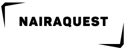
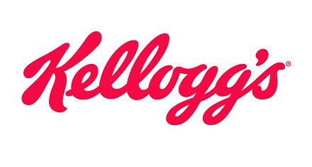
The logos (from "logos"; word and "typos"; model, engraved character) are simply words written in an artistic way, making them memorable and representative of the brand. Logos use fonts or word compositions to define themselves.
Examples of logos are in the logos of Coca-Cola, Google, Kellogg's, Telefónica, Kodak, Disney and Zara.
- You may be interested in: "The 7 elements of an advertisement"
2. Isotypes
Isotypes (from isotype: International System of Typographic Picture Education) are symbols or graphic representations that They aim to highlight some meaning, value or concept of the brand, becoming the most iconic part of its graphic representation.
As it relies mostly on images rather than letters or words, it takes some time and consistency of use to get the audience to learn to identify the brand behind the same. When it is achieved, the isotype as soon as they see it makes the client recognize the brand at a glance, without the need for words in between.
Examples of isotypes are found in brands such as Shell, Nike, Apple, Twitter, McDonald's, Firefox and Chrome.
Within the isotypes we find the following categories.
2.1. Monogram
A monogram ("mono", one and "grass", letter; "Which is written in simple letters") is a construction formed from the union and interlacing of several initials creating a unit.
Monograms are one of the oldest logos due to their simplicity when making them, being the signature of Charlemagne one of them. We also find them outside the world of marketing, as for example in livestock, branding the cattle and marking it with the identity of the owner.
Examples of companies whose logo is a monogram (as long as the full name does not appear next to it) are LG, Volkswagen, New Yorker, and GUCCI.

- You may be interested in: "The 10 types of digital advertising (explained and classified)"
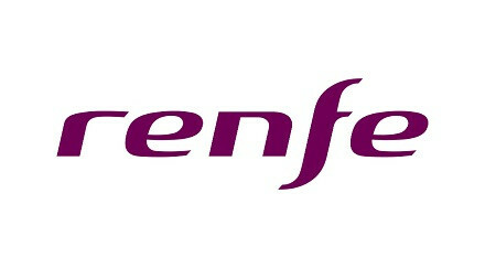
2.2. Anagram
The anagrams ("ana", forward and backward; "Grass", letter) use letters or syllables of the name of the entity represented in an artistic way, generally using contractions to avoid confusion, being especially useful for brands whose names are very long and that seek to provide an impact on the customer quickly and efficiently.
Examples of anagrams are: FedEx (Federal Express), Inditex (Textile Design Industry), renfe (National Network of Spanish Railways) and ONCE (National Organization of the Spanish Blind).
23. Initials
In Latin "acronym" means abbreviation. It would become a more radical form of anagram, in which the company name is further contracted.
The acronym differs from the anagram in that its phonetic articulation is more complicated and it has to be read letter by letter. The initials of the brand are usually used in a legible way to facilitate their reading and assimilation.
Examples of isotypes in the form of acronyms are HP (Hewlett Packard), HBO (Home Box Office), H&M (Hennes och Mauritz), IBM (International Business Machines Corporation), BBC (British Broadcasting Corporation), EA (Electronic Arts) and P&G (Procter & Gamble).

- Related article: "Market segmentation: what it is, and criteria it takes into account"
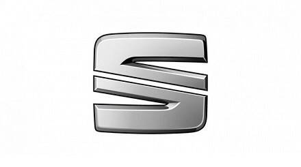
2.4. Initial
Isotypes in initial form are not very mysterious. These logos simply consist of put the first letter of the brand name, which will make up its business identity.
It is used as a synthesis resource and is quite a risky but effective strategy if the brand behind it is widely known.
A logo in the form of an acronym that we can find is the S for SEAT.
2.5. Firm
Today the signature as a brand logo is not very common. However, the few brands that dare to do so manage to give their organization a certain air of authenticity.
Its handwritten or “Script” style character creates a more intimate feeling with the company, being for that reason relegated to personal brands or that have the name of its founder.
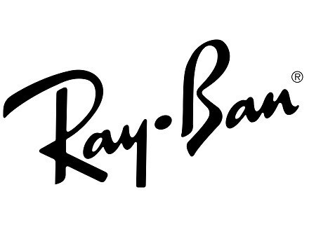
Among the isotypes in signature form we find Pepe Jeans, Picasso, Thierry Mugler, Ray Ban and Paul Smith.
2.6. Pictograms
The pictograms (from "picto", to paint and "grass", letter) they are constructions that synthesize a concept that works well as a brand image.
They can be designed in a figurative way representing something real schematically or, also, in a abstract, referring to values or feelings associated with the use and consumption of its services and products.
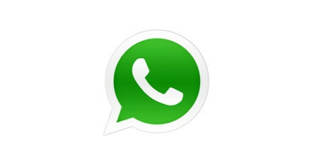
Some pictograms are those used by Twitter, Apple, Renault, Mercedes Benz, Peugeot and WhatsApp.
3. Imagotypes
The imagotypes ("imago", image and "logos", word) are the result of the combination of a logo and a isotype, that is, it is the union of the name of the company together with a drawing or other artistic element that define.
They are characterized by being constructions composed of a textual element accompanied by a symbol, and both must be in perfect balance and harmony to be aesthetically pleasing., although they constitute two divisible elements of the logo.
The typographic part, this is the logo, is clearly separated from the more iconic part, but both combine well and enhance the identification of the brand in those customers who still do not know.
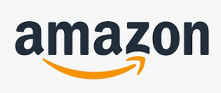
We have some examples of imagotypes in the logo of several brands (as long as the name and the drawing appear together) such as Amazon, Santander, Lacoste, Puma, Carrefour, Spotify and Adidas.
- Related article: "7 neuromarketing techniques to use in digital marketing"
4. Isologists
Finally we find the isologos. These, like the imagotypes, They consist of the union of a logo and an isotype, only in this case these two parts are indivisibly combined. Here, the word and the image would not work separately. The graphic representation of the text is very well integrated into the image, so much so that it acts as a symbol as well.
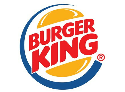
Examples of isologists we have in the logos of Burger King, Nasa, Starbucks, Harley-Davidson, Danone, Chupa Chups and Häagen-Dazs.
Which logo is the best?
There really is not one type of logo better than the other, but a more suitable one according to the popularity of the brand. For example, in recent well-known companies such as Apple, Nike or Pepsi have been joining others doing practically all their advertising campaigns and other communications using only their isotype. As they are organizations whose products are world-wide known and could even be considered their logos part of pop culture, they no longer need to resort to written words to be recognized.
However, if a brand has just been founded and it is not yet well known, the isotype is not the best logo to use. At the beginning of many large companies they always identified with something that had the written name of it, either in the form of logo or isologo, the latter being a very good option to make people familiar with our brand by associating the name with a He drew. Once a certain popularity has been reached, written support can be dispensed with or incorporated by creating an imagotype.
Whether the type of logo is chosen to identify the brand, it should be clear that it will require a lot of time, money and resources to get your target audience to receive it and learn it. It is also important to keep in mind that today, in a world where new technologies bombard us with all kinds of brand names, people are exposed to many symbols and if it is not original enough our logo can go unnoticed and be ignored.
Although it is preferable to start using a logo, regardless of the pictorial element, there are some exceptions. An example of them is if our brand has a very long name, in this case it is preferable to use an isotype in the form of acronyms or anagrams. If, on the other hand, the name of the company is very short, you can choose to use a logo or an isotype in the form of a signature or with the full name drawn in a striking font.
Regardless of the type of logo we choose, it is very important whenever we provide special care for readability. Everything that appears in the logo must be easily read by the public as we must not forget that a logo is intended to become the quick and effective way to recognize ourselves as a company. People should find it easy to read the logo and associate it with what we do.