The 17 types of graphs (and their characteristics)
Many of us actually have little understanding of certain organized data that all scientific explanation you must have in order to capture your veracity in the work you are trying to show to the world.
A series of numbers or statistics, which are worthy of belonging to a language vastly different from the one we speak (unless you are an expert in the subject they are dealing with) But in short, for the general population, there needs to be another type of representation of these data so that they can be understood and shared.
The best way to make this sample is through graphics and we are sure that those if you can recognize them anywhere. They are those lines, circles or points connected with which you can see information and the degree of its importance, impact, growth or death in a certain feature that is being analyzed.
Do you know which ones they are? If your answer is both yes and no, We invite you to stay in this article where you can see what these graphs are and what types of them exist, with their respective characteristics.
What are graphs?
Known as graphics or graphic representations, they refer to the set of visual tools with which it is possible to represent any type of data (numerical or statistical) so that they can be better understood by different people who watch.
Thus, they become an easier way to view and analyze different aspects of this data, such as growth, death, extent, impact, correlation or causality between them, with respect to a raised evaluation issue.
These graphs are used very frequently by different groups of people, either to explain scientific data or to appreciate the population density of a sector, the magnitude of the impact of a brand or the financial gains and losses of a company. This versatility is due to the fact that most graphics can be used for different purposes and not necessarily for a specific one.
Types of graphs and their characteristics
Here you can appreciate a little better than what we talk about in this article and you will discover the thousands of uses of graphs, in order to understand when you can use one or the other for your projects, research and academic or professional work.
1. Bar graphic

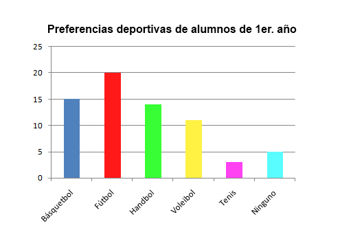
It is the best known and therefore the most used to represent data in the form of bars, it is also known as a ‘bar diagram’ and its purpose is represent the frequency of various conditions, that is, the higher the bars, the greater impact this data has and the lower, the less impact. They are represented in two Cartesian axes, where they are divided by groups (lower horizontal part) and the value that each data represents (vertical line).
2. Pie chart

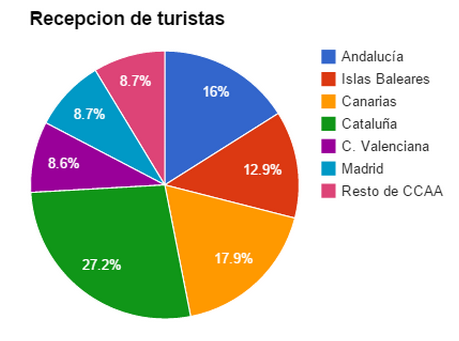
Also called pie charts or pie charts, it is another of the best known and used for its simplicity when capturing data. Its use is common to represent the proportions of different quantities in a larger total, that is, the parts of a specific object. At the same time, it provides enough information to evaluate the impact of each part with respect to its presence (according to the thickness with which it is represented in the graph).
3. Calendars
Surely you are thinking, is a calendar a graph? Well, in terms of data organization, if it is, because calendars offer us the best way of ordering the days with respect to the weeks of each month and in turn the disposition of each month in the year. Thus, it is possible to add information data on what happens on a day-to-day basis, plan future events and establish action limits with respect to time periods.
A great advantage that we have today is that it is easier to manage our calendars thanks to digital devices, in which we can place reminders or add data to be reviewed.
4. Mental maps
Believe it or not, mind maps are also a type of graph, since it allows you to establish ideas that arise at the moment, thoughts, doubts, keywords, images or concepts to be developed soon. It is a great way to find associations, relationships, generate solutions and answers, structures and visualize a topic in general. Most of the time they can be used to study or to reach group agreements.
5. Bubble map
These are most used in the area of geographic or social data, where circles are established in an area demographic and have different sizes depending on the magnitude of the value that you want to establish or analyze. Thus, they are suitable for comparing proportions of data according to each region without the need to worry about the size of that region.
6. Connection map
This is also used to observe sociodemographic connections and relationships, only these are applied more frequently to assess distributions from one specific point to another, expansion of a point towards different objectives and the impact of the expansion of the same with other territories. Just like a route map through link chains.
7. Line graphs

These are more common to be found to represent the falls or rises of the economic market, try to imagine those lines that look like peaks of low and high mountains with points at each peak. Precisely because its main function is the comparison of the increase or decrease of variables in a determined time thus, it is possible to observe the evolution flow and it is possible to evaluate the best moment to Act.
8. Histograms
At first glance they are very similar to bar graphs, but it has the difference that a graph of line where it is possible to observe the evolution of the values or variables to be evaluated with respect to the frequency of themselves. This provides more complete information regarding the spread of the data and the inference of probabilities.
9. Scatter plot
These are represented in a Cartesian axis space, which is why it is also known as an XY graph, where the data obtained are represented with points. in a specific place on the graph, depending on its relationship or influence between variables, generally between dependent (X) and independent variables (Y). Leaving a kind of smoke scattered throughout the graph.
10. Pictograms

They are cataloged as analog graphs of quantitative data, where they are most frequently used to position social behavior with respect to population density. That is, you can see it as the drawings of people that are located on a region map. They are more common when establishing the population of a place, establishing ages, social conditions or to see the number of votes obtained in a political election.
11. Box-whisker chart
They are also used to represent data dispersions, but this time they are grouped into different value boxes depending on their magnitude or their most important characteristics. They are represented in three quartiles, where the second or half is represented by the box and the ends are the whiskers that offer the representation of the data stored in the box.
12. Arc diagrams
These are used to observe the relationship between different connection points, which can be intertwined or expanded. All the variables to be studied are placed in a lower line and the arcs would be the representation of the dynamics between them.
13. Area chart
In this type of graph it is possible to observe the accumulation that arises from the relationship of the variables dependent and independent, as a way of evaluating the magnitude of a variable with respect to other. So if one is superior to the other, it can be seen as the opaque one on the graph.
14. Candlestick chart
Also known as the Japanese candlestick chart, it is another chart widely used in the observation and analysis of the stock market, only that in this it is not only possible to appreciate the evolution or the fall of the values, but each candle provides valuable information with with respect to each increase or decrease of the movements made, so it is very beneficial to do business at the right time.
15, Cartograms
They are very frequent in the health area, to determine the health status of a sector or, failing that, to monitor the spread of a disease throughout the territory. Although they can also be used to evaluate the frequency of any geographic or social variable.
A legend with different colors is also added to this graph to better represent and understand this expansion.
16. Dot matrix chart
It is used to represent and group various categories in a general matrix, as well as to distribute their proportions. Which are established by a specific color point which can be converted into a unit or symbolize a set against others.
17. Bullet graphic

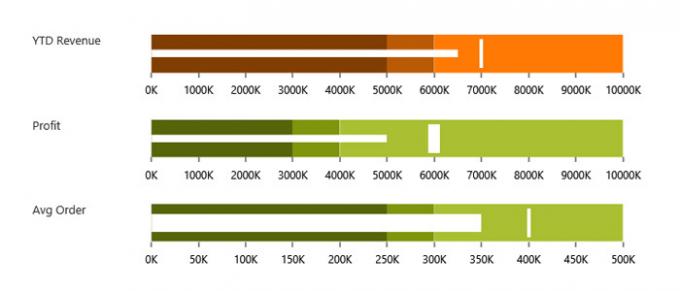
Often used to display performance data or as a timeline, divided into colors depending on the variable to be analyzed, which are represented in bullets or sectors of the linear graph. Its greatest benefit is that it can offer a longitudinal view that indicates the range of values.
